Website Design Services
Mobile Websites and SEO for Fox Valley Area Businesses
Want to wake up your business? Add the power of responsive website design that works on any device, is found on search engines, and generates interest in your products or services.
Gary Cole Design specializes in custom mobile-friendly websites that are “Search Engine Optimized” (SEO) to break through the internet background noise that’s holding your business back. Enhance your business branding and marketing with a website that gets results.
Ready to shift your marketing to a higher gear? Contact us or call 630-779-9130 to learn more about our responsive website design services!
Responsive Website Design

- Custom Website Design
- Mobile-friendly Websites
- Desktop, Tablet, and Phone Compatible
- Results-oriented Design
Search Engine Optimization

- SEO Best Practices
- Search Engine Keywords
- Optimized Page Content
- Google Analytics Set-up
Website Support

- Website Hosting
- Website Maintenance Services
- Domain Name Support
- SSL Certificates
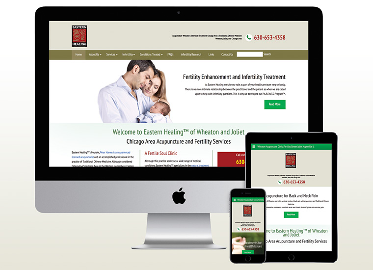

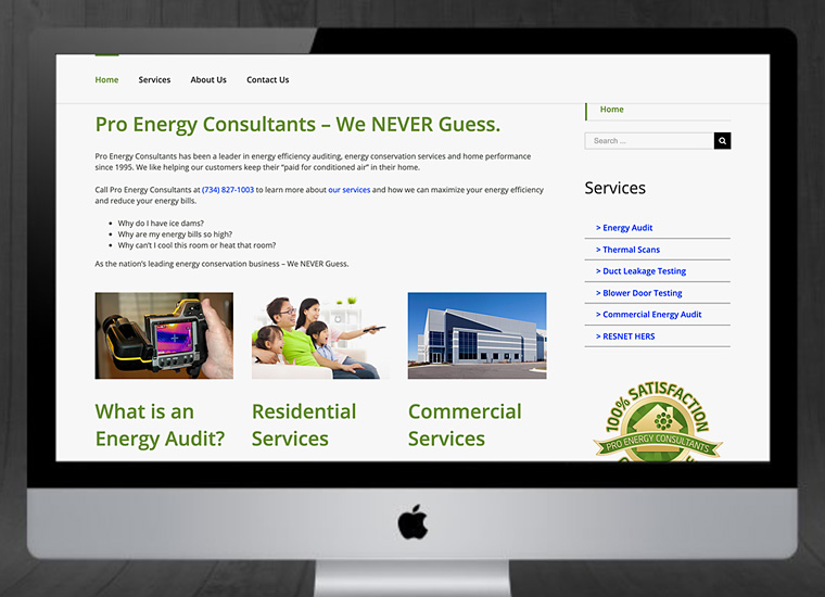
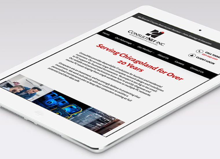
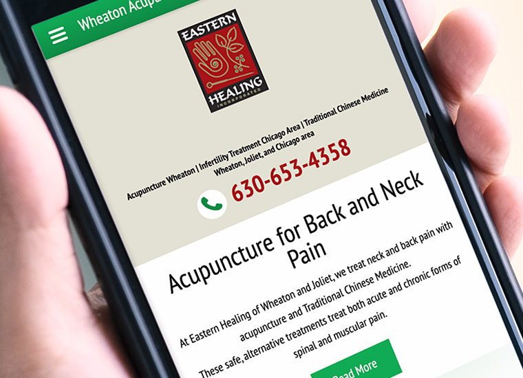
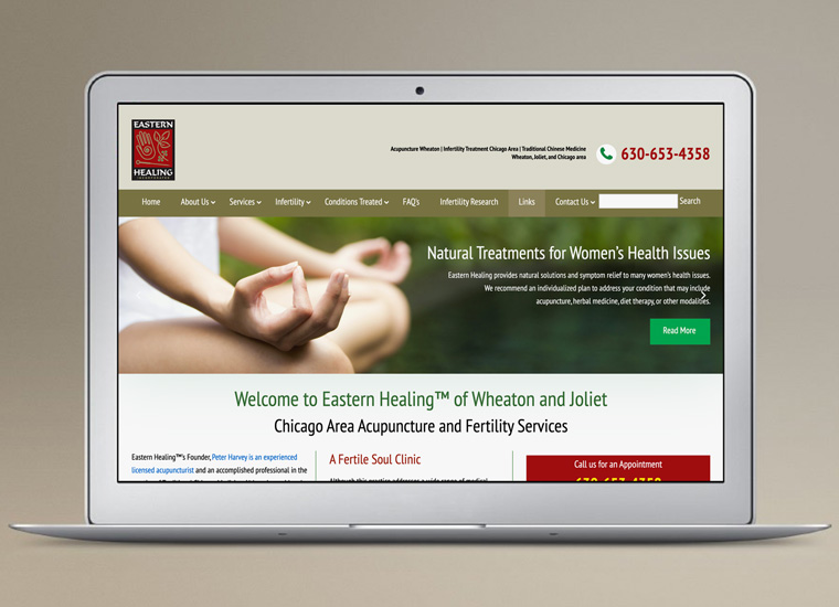
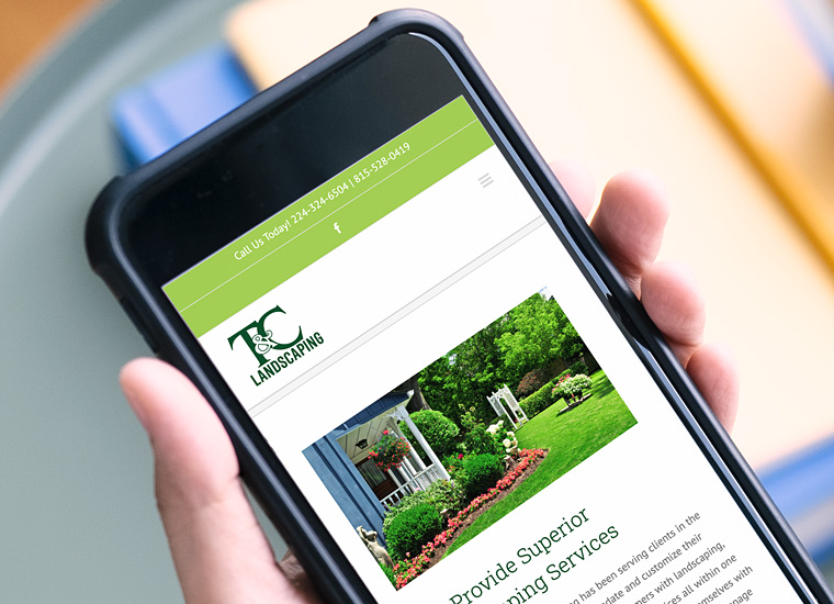
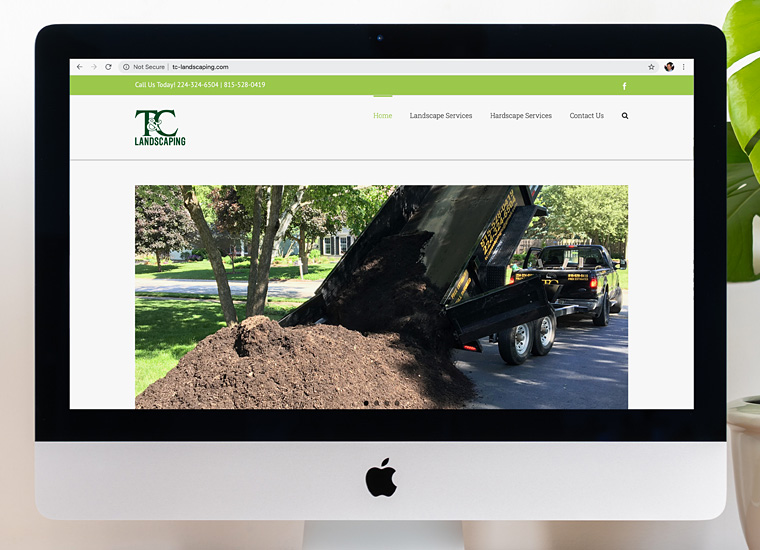
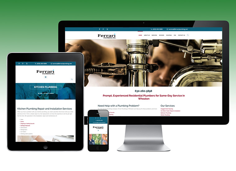
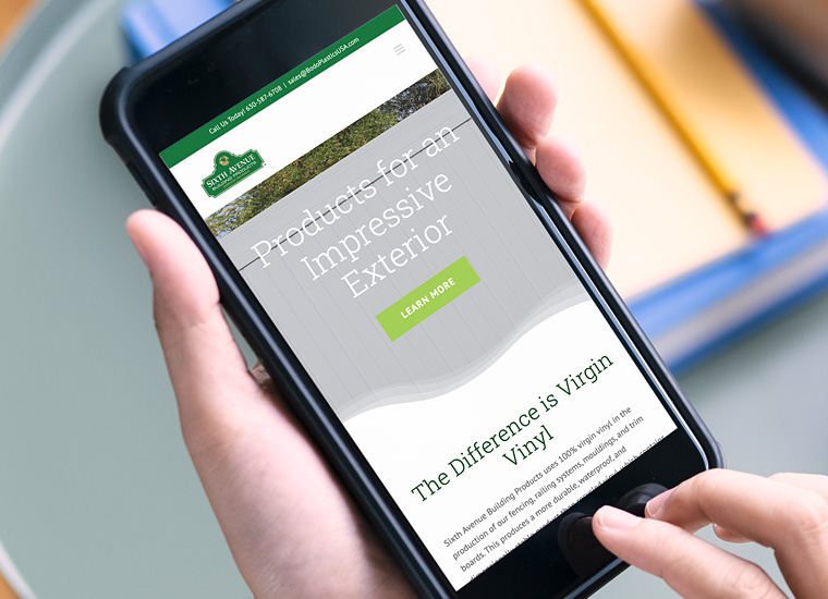
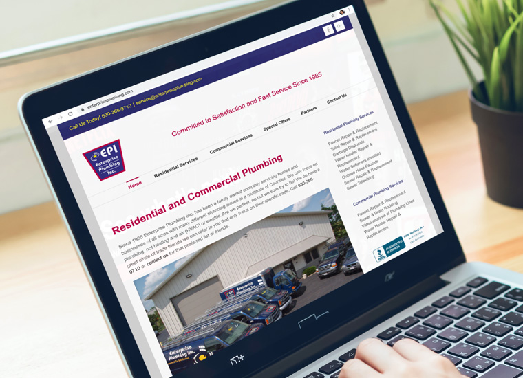
Responsive Website Design
Whether you need a simple website to promote your products and services, or a more complex responsive design, dynamic site with a custom database backend or e-commerce functionality, we will construct a site that meets your requirements. Your custom designed website will invite users to explore the site and will communicate your message effectively and drive sales. Contact us at 630-779-9130 to discuss your website project.
Why Your Website Needs Responsive Design
The use of mobile devices has increased exponentially over the years. In fact, mobile traffic has surpassed desktop usage in 2014. More and more people are using smart-phones and tablets these days to search the internet.
Unfortunately trying to view a website from one of these devices isn’t always a great experience. Creating a website version for each of these resolutions and devices is impractical. To handle this change, companies are moving towards responsive or adaptive design. Wondering if your website should also be optimized for mobile?
Only One Website Needed
It used to be that companies could have two websites, a regular website and then a separate mobile website. Responsive design allows your site to adjust to the size of the screen it’s being viewed on no matter if it’s a smartphone, tablet, or desktop thus eliminating the need for two separate sites.
Although it may take some time to initially set up a responsive website, it will take less time in the long run when the site needs to be updated since only the one site will need to changed.
Google Prefers Responsive Design
Google prefers responsive sites versus mobile sites when it comes to search engine optimization. Mobile sites require a different URL for it to crawl and index multiple versions of the same site.
You can still create mobile website pages, but you will need to use rel canonical tags to tell Google which page they should account for in rankings since you will have duplicate content from your mobile and non-mobile website. This is why it’s just easier to have one responsive site that covers all of this.
Best User Experience
A well put together responsive web design is the simplest way for users to interact and funnel through a website. Not having a responsive site does not create an optimal user-friendly experience. Most likely that person will leave the site never to return again.
Google takes those bounce rate metrics into account in 1 of their 200 ranking factors. So you want to give the user the best user experience design possible to help lower your bounce rate and provide the best calls to actions.
Users should have a seamless experience when navigating through the site and you will easily find things whichever device you decide to use. They need to be able to read text, fill out forms, and get to the content they want to see without any frustrations on your site.
If a user has a positive experience on your responsive site, they are more likely to stay, not bounce back to the search results, and convert into a buying customer or lead.
To stay ahead of the competition, you need to stay ahead of the game. If more and more users are using their mobiles devices to search and make purchase online, you will need to cater to this audience by creating a mobile-friendly site, like a responsive design. It is becoming the go-to format for web design companies and quickly gaining popularity.
Reference: Mike Juba, Content Marketing Strategist at EZ Solutions.

